 |
|||||


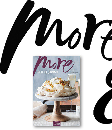
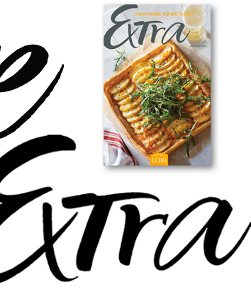
Spontaneous and artistic, as if a painter had added their signature, was the look this lettering aimed for in the design of this masthead. It gives a hint at the creative recipes inside this popular LCBO publication. A combination of upper and lowercase; script and print; thicks and thins give a fresh and current vibe to the lettering. The French masthead 'Extra' was designed to match.
Food and Wine | Magazine | Periodical | Masthead | Lettering | Vintages Publication | LCBO | More + Extra
Food and Wine | Magazine | Periodical | Masthead | Lettering | Vintages Publication | LCBO | More + Extra