|
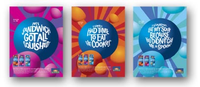
The challenge here was to design a fish-eye look for type that would still be readable. At first glance you might think that we simply applied a filter, when in actual fact the lettering had to be drawn from scratch, originally when the filter was used, it was illegible.
Type Design | Mimicking Fish Eye Effect | Vita Burst Print Ads | Sun-Rype Products
|

